Have you ever loved a painting but can’t quite put your finger on why? Chances are the artist used strong colour combinations. With some colour theory up your sleeve, you can too. To get you started, we’ve put together a quick guide on how to choose great colour combinations using a colour wheel.
What is a colour wheel?

A colour wheel is exactly what it sounds like – a range of colours organised around a circle. These colour hues are positioned to show the relationships between primary, secondary and tertiary colours. To use a colour wheel, rotate the face so that one of the holes lines up with your chosen colour. The rest of the holes will then line up with colours that are harmonious or complimentary to it. But before we get stuck into how to combine these colours, let’s break down the basics.
The main colours on the wheel
Primary Colours
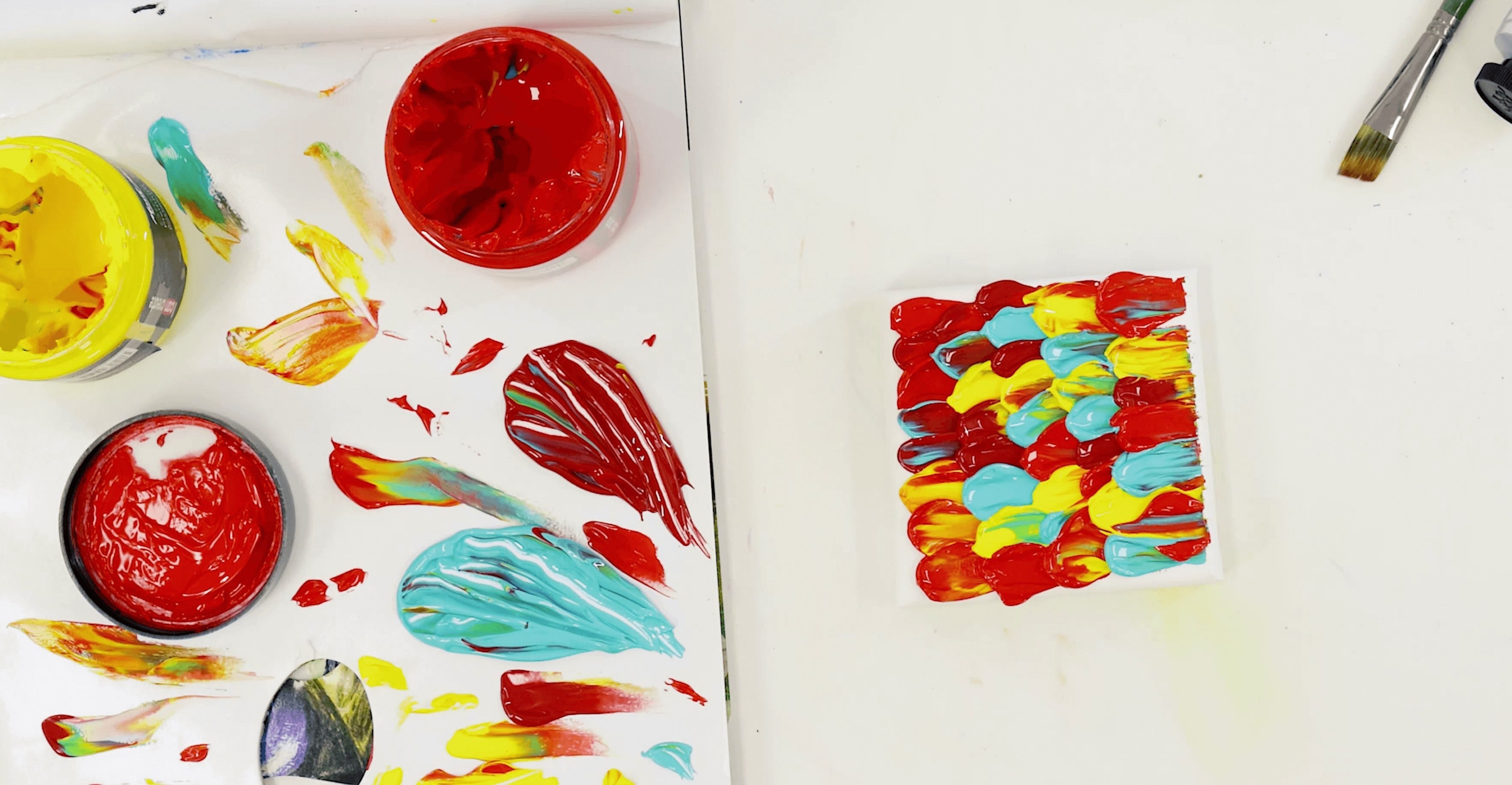
The three main primary colours are Red, Yellow and Blue. These, or variations of them, look great when used in a painting together. Primary colours can be thought of as the parents – they are the source of all other colours and they can’t be created by mixing other colours together.
Secondary Colours
Secondary colours are the three colours (Green, Purple and Orange) that are formed by combining the primary colours.
Tertiary Colours
Tertiary colours are created when you mix a primary colour with a secondary colour.
Colour Combinations

Complimentary colours
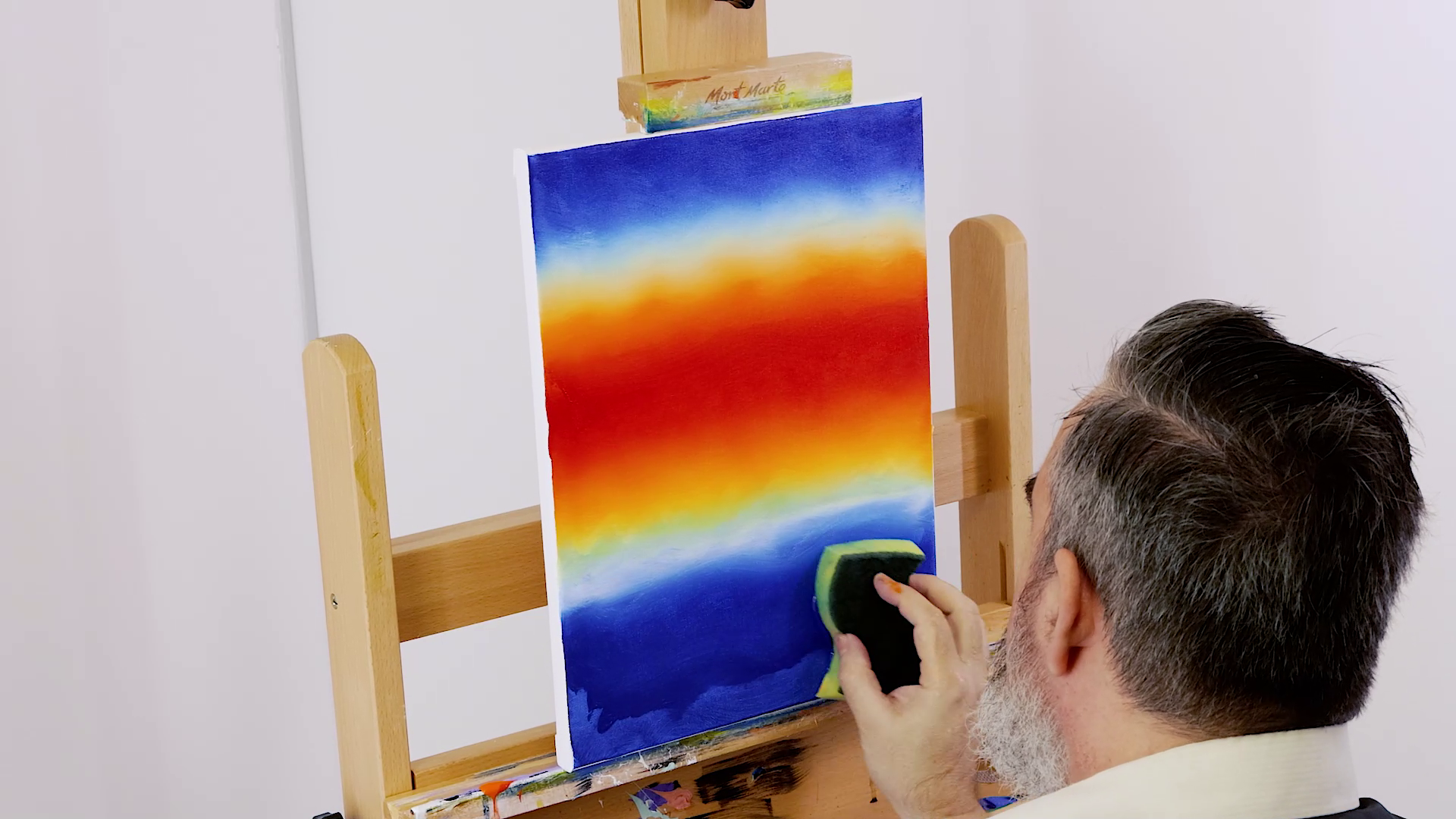
Now that you have a basic understanding of the main colour groups on the wheel, let’s get into the nitty gritty of combining colours. Complimentary colours sit directly across from one another on the colour wheel. When these colours are used next to each other they create a very strong contrast and can be used to make some interesting optical effects. For example, complimentary colours are often used in shadows – the shadow of a red apple may appear to contain some Blue-Green.
Split complimentary combinations

A split complimentary colour scheme is a variation of complementary colours. The difference is, instead of using the colour directly opposite your base colour, you use the two colours either side of it. This combination has a similar effect to the complimentary colour combinations, but it’s generally less intense. This creates a more subtle effect that is often a good choice for beginners.
Tetradic, triadic and analogous colour schemes

Tetradic combinations
Tetradic colour schemes use four colours in two complimentary pairs. If these colours were connected with lines they would make a rectangle, which is why it’s also commonly referred to as a rectangle colour scheme. Like the Triadic colour scheme, it works best if you make one colour dominant and use the other three as accents.
Triadic combinations
Triadic colour schemes use three colours that are evenly spaced around the colour wheel. The colour harmonies created by these combinations tend to be vibrant, no matter what colours you use. Triadic colour schemes work best when you choose a dominant colour and use the other two as accents.
Analogous colour combinations
Use colours next to each other on the colour wheel and you’ve got an analogous colour scheme. Analogous colour combinations are often found in nature and create a harmonious and slightly monochromatic look. To use these colours well, choose one to dominate, a second to support and a third to use as an accent. Choosing three colours often works the best, but you may also like to use four colours (using the fourth sparingly).
Exploring negative space

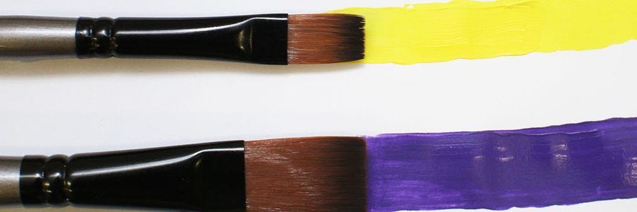
If you’ve heard the term ‘negative space’ thrown around but you’re not sure what it means, it’s actually pretty straightforward. Negative space is simply the area that surrounds an element in a painting – such as the sky around a tree, or the background around a figure. You can create powerful backgrounds by identifying the dominant colour in an artwork and using one of the colour wheel combinations mentioned above. For example, you could paint a Green tree against a Red background or Purple text against a Yellow background.
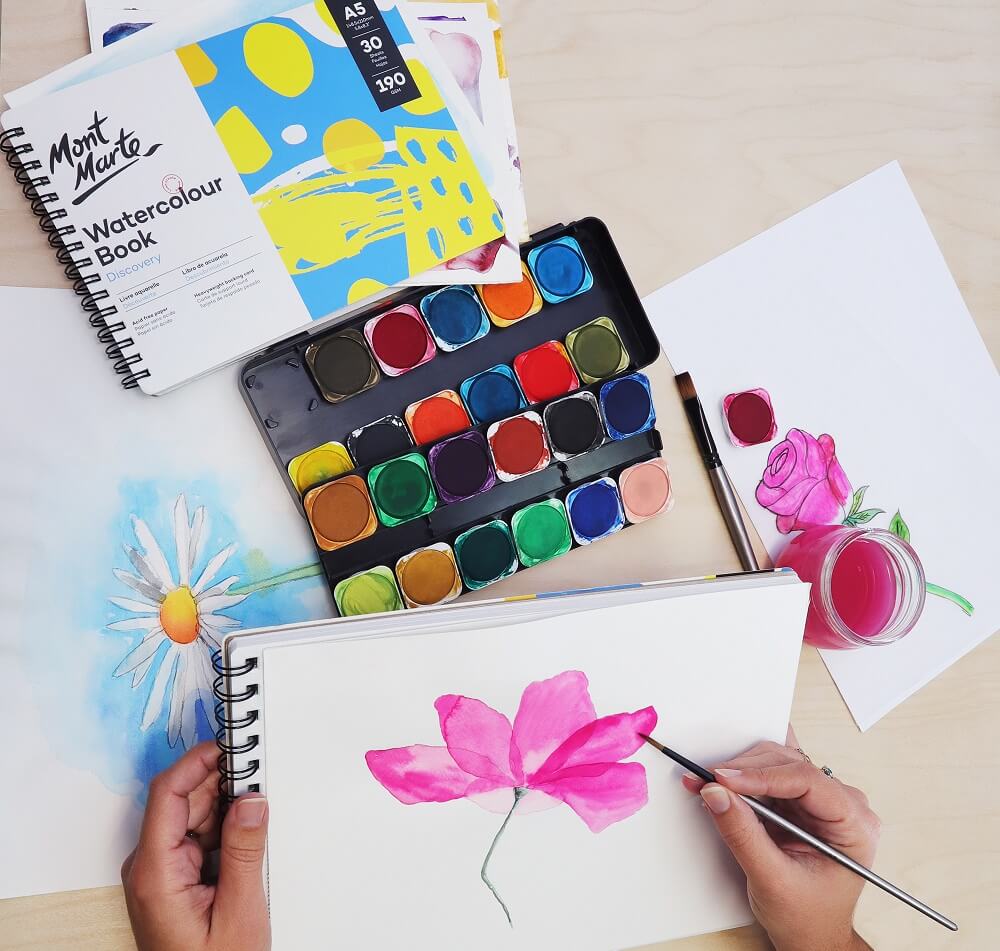
Colour theory can seem daunting at first, but it’s actually a lot of fun once you get into it. Before you start on your artwork, play around and explore some different colour combinations in your art journal. Exploring, learning and practicing is all part of the process!


