


Learning to paint landscapes may seem tricky but really, anyone can give it a try! You may find trying some of the techniques in this blog gets you on the right track to creating a landscape painting at home. So, follow along and find out some handy techniques that might help you with your next project.
Landscape composition

There are lots of different composition ideas, thoughts, and ‘rules’ to be found online when it comes to capturing a landscape. While you can technically compose your landscape however you like, a handy recommendation that’s easy to follow is the rule of thirds. Simply imagine your painting surface is split into thirds and try to place your main focus at a point where the thirds intersect. For example, this may be where the first and second third meet, or where the second and third meet.
One of the main reasons to follow this rule is to create a more interesting composition, avoiding a simple 50/50 split of your canvas with a central focus. Imagine you’re painting a seascape. The horizon will either hit the 1/3 mark or the 2/3 mark, changing the sky-to-sea ratio in the frame.
The composition is up to you, but maybe have a look at some of your favourite landscapes and take note of where your eyes move when looking at the painting. You may want to try the same kind of composition with your own reference! We've included a WIP landscape with the rule of thirds applied above - check it out to see how the path divides the composition.
Creating a focal point
Other than the rule of thirds, it’s a good idea to think about where your eye will travel when looking at the landscape. You will naturally look first at your main focus, but where next? When you compose your painting, think about the journey you want to create, whether it’s a diagonal line, zigzag, or even a swirl effect. A winding road may take the eye on a zigzag through the picture, while rocks jutting out of the ocean may create a swirl effect moving from foreground to background.
To create a focal point in your painting, you can use a few different techniques. Adding finer details, stronger colours, paint texture, or creating contrast can draw the eye to your chosen focus areas. Your main focus may be a few small subjects, a mountain range, the setting sun, or a winding river – the possibilities are endless. In our example, we have used the contrast between the bright colours in the surroundings and muted grey of the path to draw the eye to the path. It is the main point of contrast throughout the painting, creating a focal point.
It can help to draw attention to your focal point by abstracting or simplifying the remaining areas of your painting. You don’t need to create perfect realism on every inch of your landscape, you may imply texture on subjects further away or outside of the focus area, reserving fine details and texture for your main subject. On the flip side, you may have greater detail outside of your focus point, with less detail drawing the eye, like the path in our example for this technique.
Tonal distribution

Understanding tonal values is important when painting a landscape. We have a handy video that may help explain this process, helping you to find tonal values. Most of the time when creating a landscape painting, you can follow a basic set of rules that apply to most references.
- The lightest tone is usually the sky.
- Any shapes or subjects that are horizontal are typically the next lightest, as they reflect the sky’s light.
- Angled or diagonal elements are the darker mid-tones, as they reflect some, but not all, of the sky’s light (think: side of a mountain).
- Shapes that are vertical typically are the darkest tones as they are unable to reflect the sky’s light (think: tree trunk).
There are of course exceptions to these rules, like if a tree trunk has white bark or if a sunset affects the light direction drastically. Having said this, it helps to understand the basics when it comes to tonal distribution!
Making shadow colours
Shadows may seem simply black and grey, but most of the time this isn’t the case. A lot of the time, a lack of light can be created by painting a deeper cast of the sunlit colour. For example, when painting a tree, the shadow colour will typically be a darker green, rather than black. This creates an impression that sunlight is hitting part of your tree, casting the rest into darkness. The shade usually won’t remove the tree’s colour, but it will lower the saturation (or intensity) of the colour and deepen it.
Check out the project above to see these realistic shadows in action. Note how there's very little black shading to be found!
Colour saturation

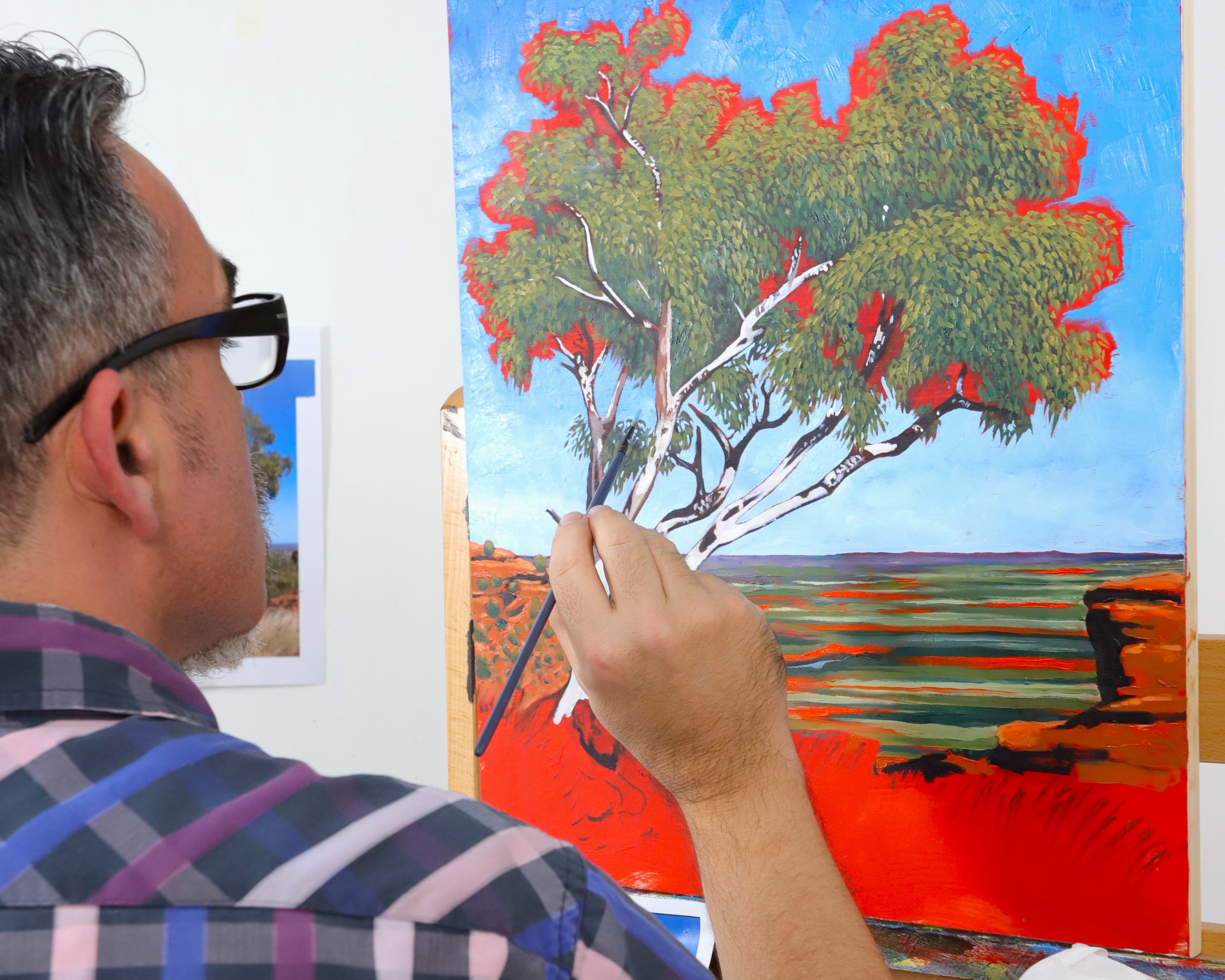
Changing the saturation of paint colours draws your eye to different parts of the landscape. This can help when creating your focal points, as it can create a pathway for the viewer through your painting. For example, in the painting above, we added bright, saturated yellow and a spot of purple around the tree to emphasise the focal point. The tree is placed 1/3 vertically across the canvas, with rich greens and bright yellows to create a strong contrast with the surroundings. In the foreground, there are more saturated colours, including more yellow and also purple, to draw the eyes from the tree for the second focus area (note, it is 1/3 horizontally up the canvas).
Similarly, less saturated colours are drawn away from the eye, such as the grey mountain on the left in the background, and the top left corner of the sky. This helps when creating dimension and fine-tuning the journey your painting creates for the viewer.
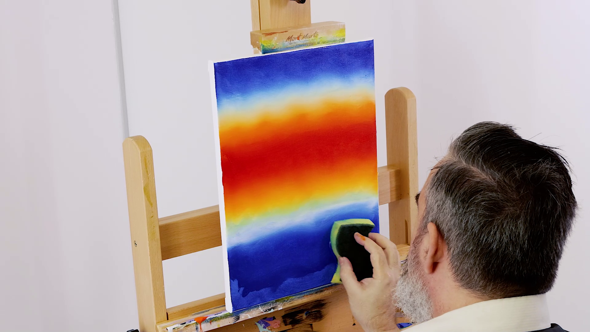
Paint temperature
If you’re capturing a time of day or environment, colour temperature can be important when bringing it to life. Using both cool-tone and warm-tone colours creates a dynamic painting by increasing contrast. It’s helpful to remember that even if you feel like most of your reference picture is warm, adding a cool shade can create a dynamic dimension in your landscape.
For example, whilst the temperature of the painting in the example video is wholeheartedly warm-toned, the cloud highlights are painted with a mixture of a cool-toned yellow (Lemon Yellow) and white, making the clouds pop against the warm background.
Editing your reference
You don’t need to include every detail from your reference when painting. Even for a realism landscape, it’s okay to remove bits and pieces from your reference that may detract from the overall composition. There may be a telegraph pole or car that takes away from the natural serenity, or else a tree branch that is poking out weirdly. You can simply choose not to paint these into your landscape, as they may create a contrast that draws attention from your focal point or adds busyness to your canvas.
For example, in our example video, resident artist Joe removes a tree from the middle ground as it detracts from the overall composition of the painting (see from 02:47). It’s never too late to edit your composition, even if you’ve already painted it!
Impressionism scenery techniques

Capturing scenery with less accuracy and more feeling can be a great way to depict a landscape. For an impressionist feel, it’s best to represent the background with more abstract paint strokes, bringing the scene to life with contrasting tones to embody the elements of the environment, without painting the details. Impressionism has a strong focus on capturing shifting light with colour, so the goal is to represent the effect of the light on your scene.
This is done by working quickly with short, thicker strokes of colour that map out the essence of your subject matter, rather than its image. Don’t shy away from bright, saturated colours to emphasise the sunlight hitting different areas of land or foliage.
We have a handy project video that details how to paint an impressionistic desert scene, which may inspire you to give it a go!
Abstraction

You can also lean towards the abstract for your painting, choosing unreal colours and stylised outlines to create the idea of a landscape. Pick a palette of colours that have good contrast and appeal to you. Map out your concept, remembering to still try and apply the rule of thirds when creating the composition. Lay down blocks of colour that resemble the play of light on the land, without using realistic colours. Think about how you may want to use texture or patterns to capture the landscape, and which areas you will outline to bolden and draw the eye.
You can use varying degrees of abstraction in any landscape painting, to attract the eye or blend elements into the background. This technique and style are good to experiment with as they can be used on a sliding scale for most artwork. We’ve got a handy tutorial that teaches you how to paint an easy textured, abstract landscape if you’re looking for a starting place.
Now that you know 10 landscape painting techniques, you’ll be set to have a go and try them out yourself! 😊 If you’re starting out with sceneries, we have a number of guides and projects that may get you started for your first landscape painting.
We hope that you feel inspired to try these techniques for yourself. #montmarteart or tag us @montmarteart on Instagram or Facebook as we’d love to see what you create.
Looking for more? Check out our tips and techniques page for more inspiration. If you need supplies or want to experiment with one of the techniques mentioned, jump online to check out our paints and canvases.